Lucy Doran Design
2023
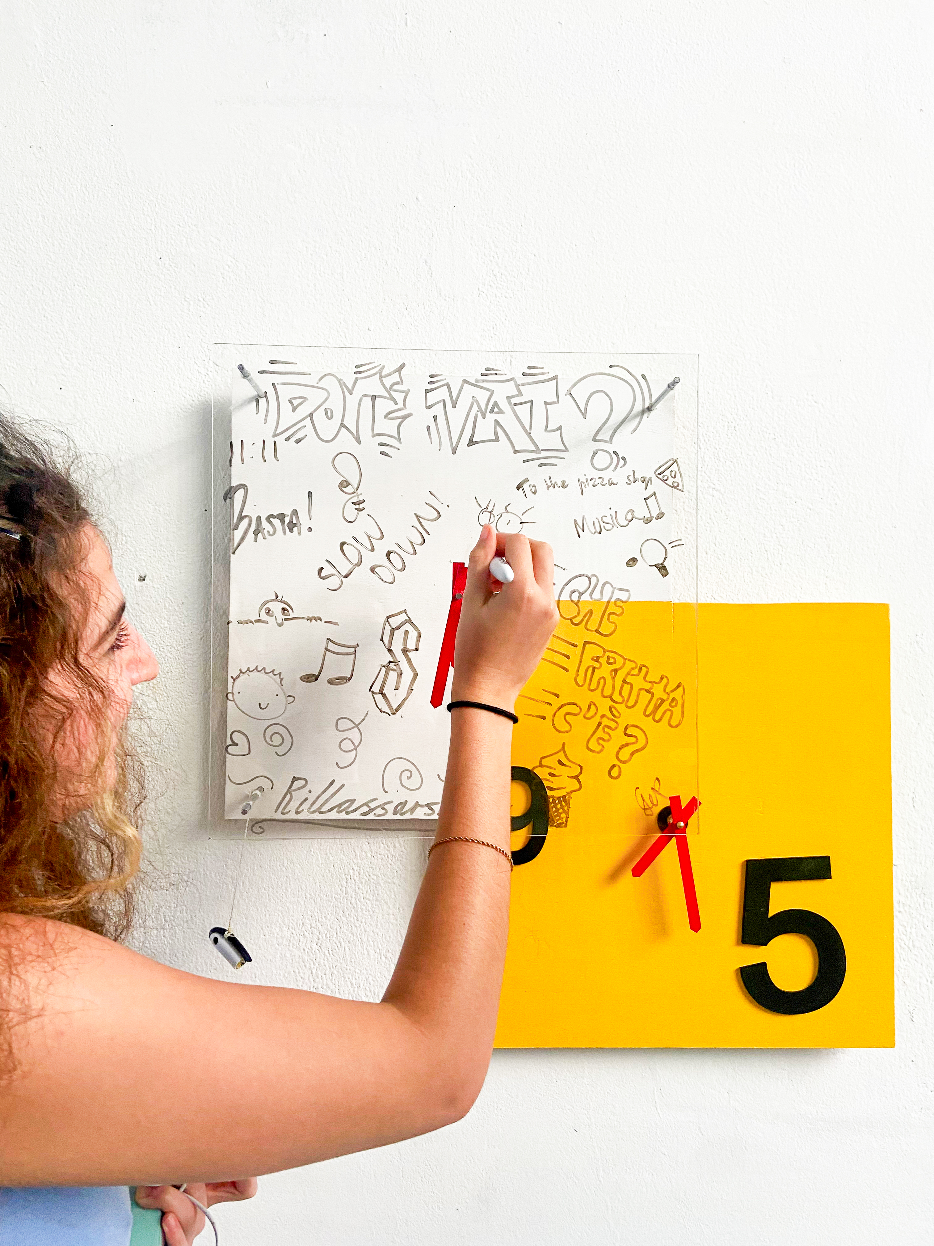
Time in the Metro
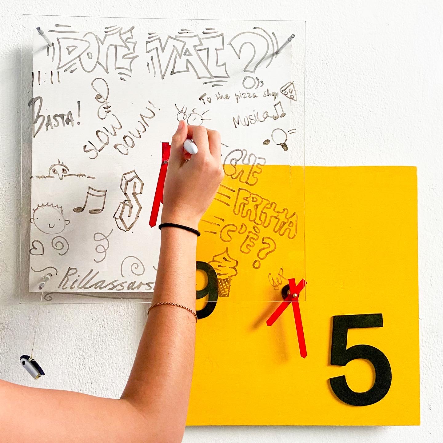
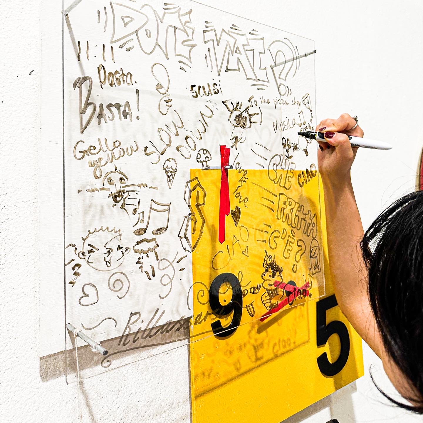
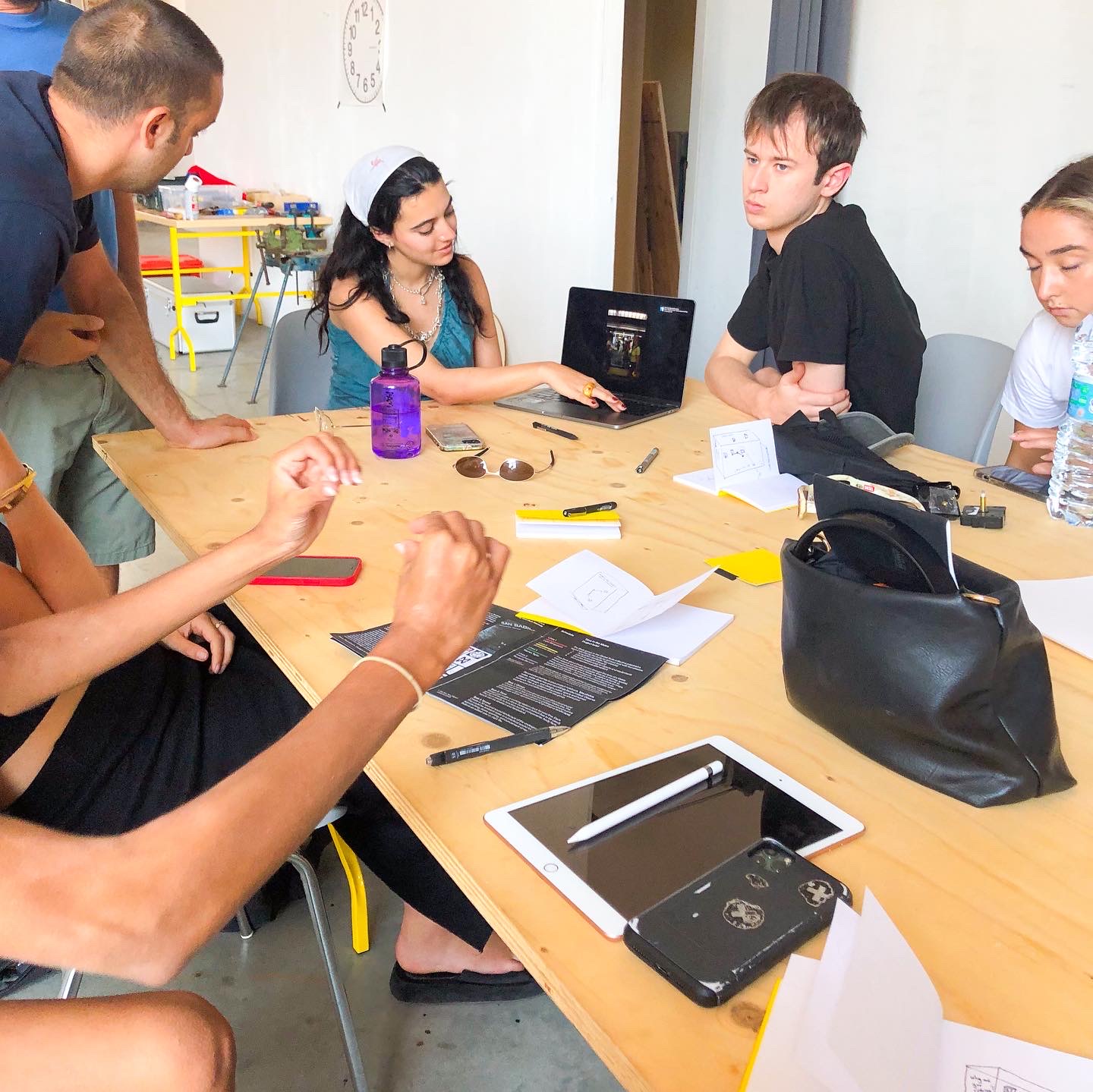
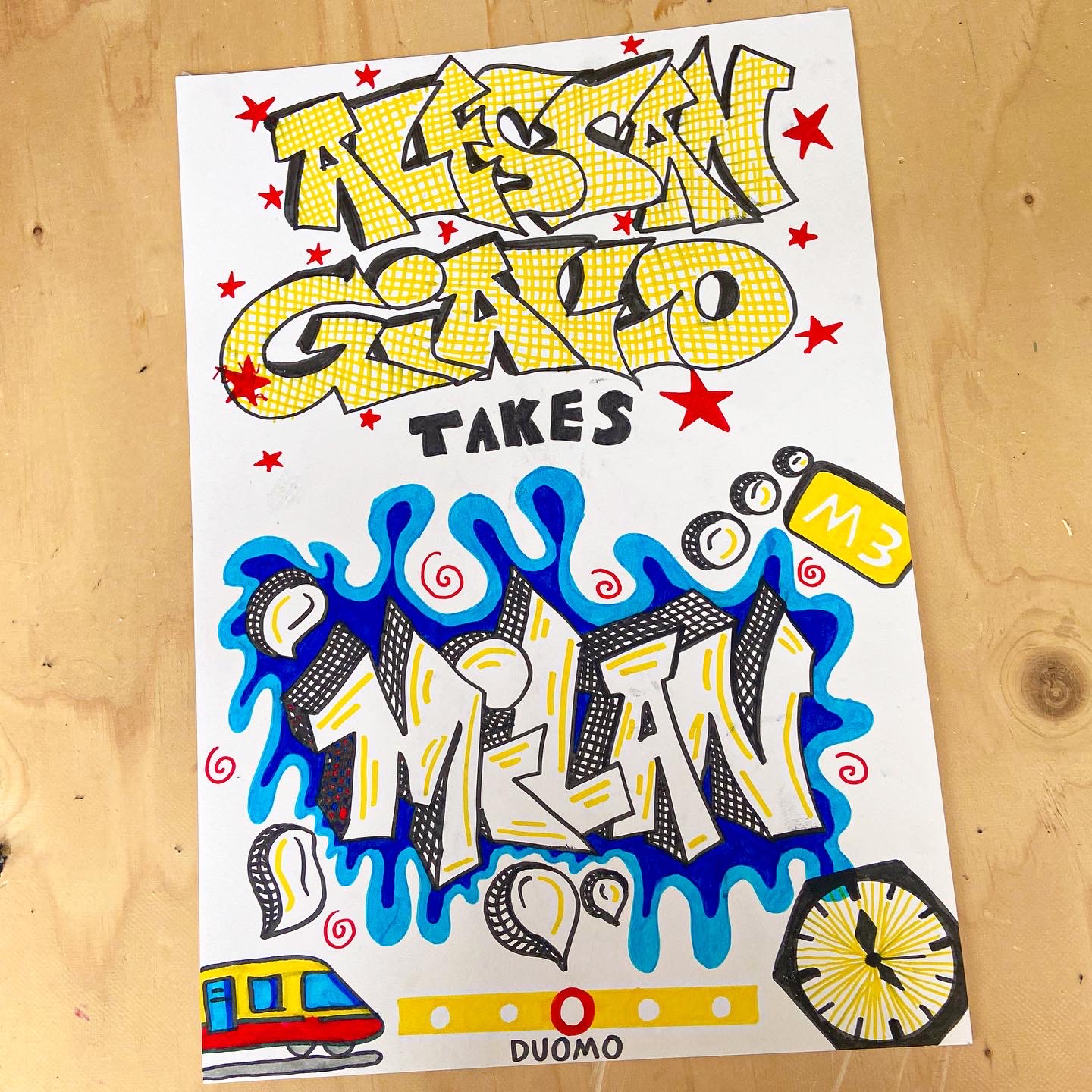
My team (Alessangiallo) were tasked to explore the yellow line in the Milan underground metro. We then constructed a clock based on our impressions of this intricate underground landscape. Our final clock reflects the contrast between the activity on the yellow line during the weekends in comparison to the activity during the work week.
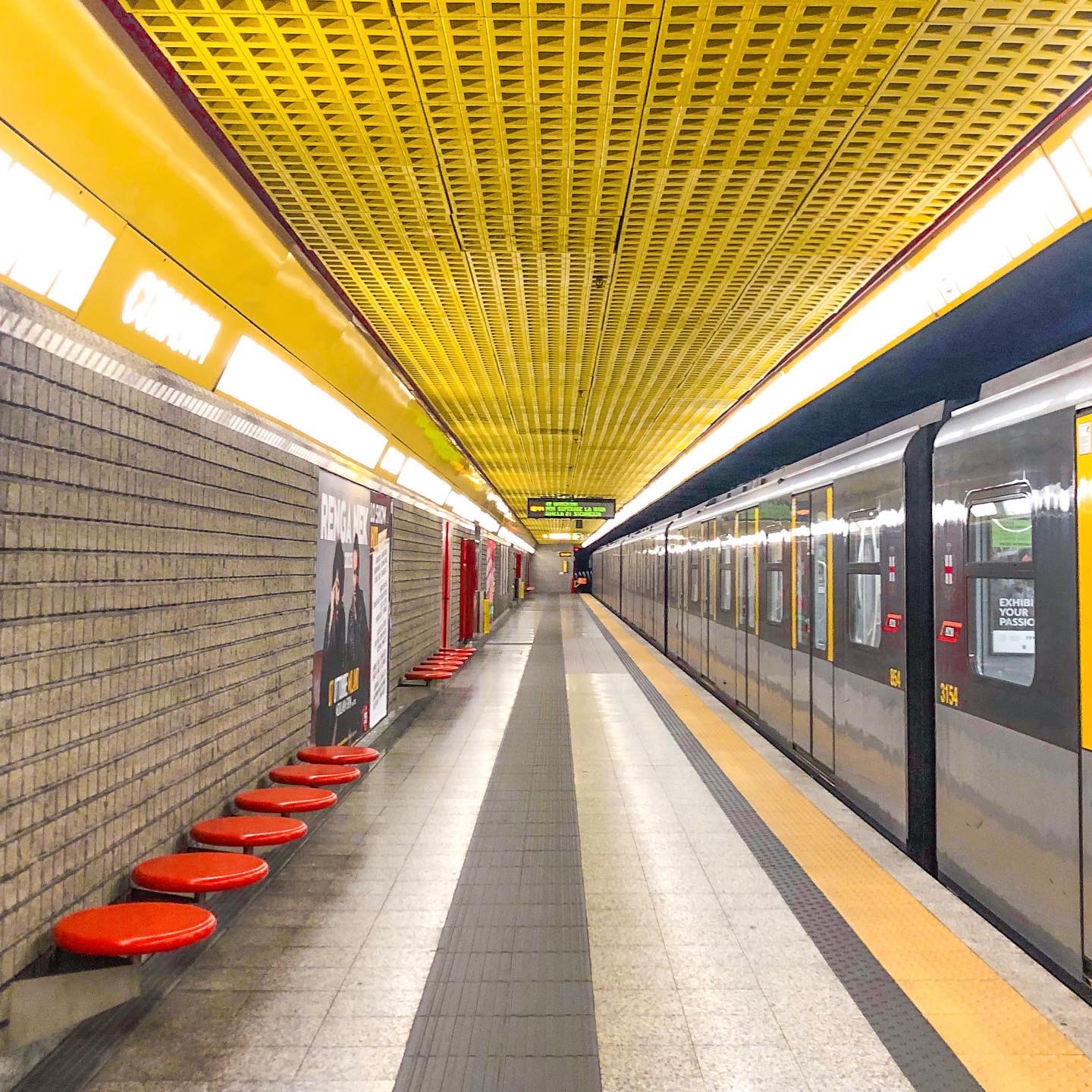
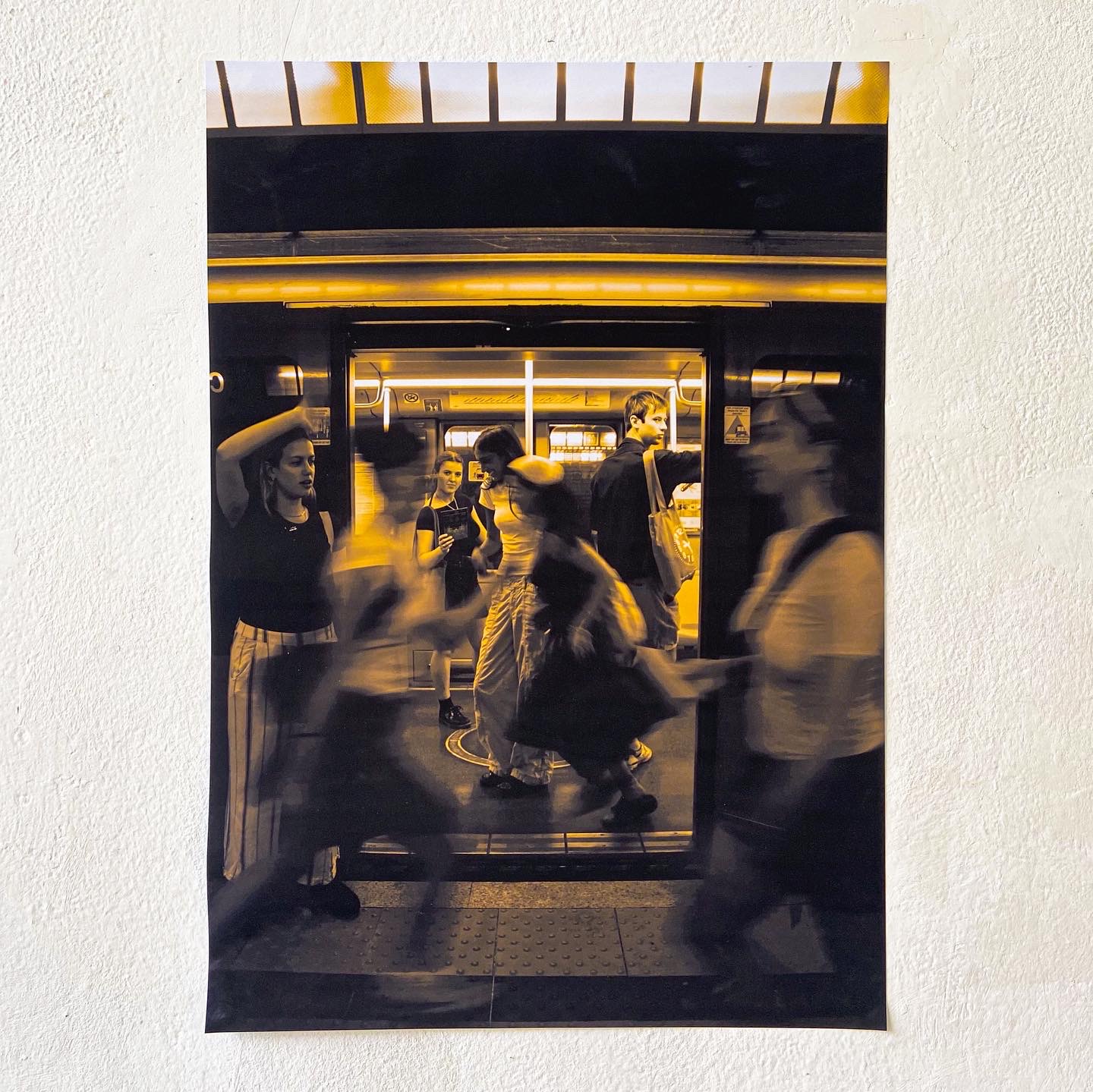
The main aspects of the yellow line that the yellow team and I ventured to was the Duomo station, Milano Centrale station and lastly past near the country side. I was impressed by the consistency in colour theme across the visual design of the station. Every bin, roof, train seat and more was a shade of yellow to clearly communicate to travellers that they were on the yellow line. Additionally, the symbols of squares and circles seemed to extend past the yellow line to the other colours as a reccuring geometric pattern. This conveyed a sense of unity throughout the lines regardless of the colour.
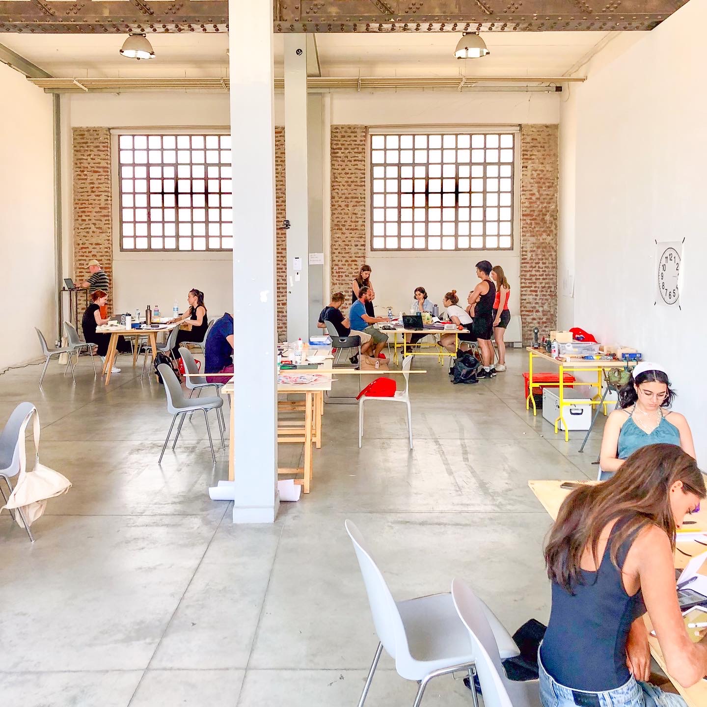
As a group, we took these expreriences back to the studio where we mapped out a concept and direction of the clock. We were all on the same page with the idea to include the colour yellow and at least a square or circle as the geometric shape resembling those found in the station. We felt as if the station was fairly quiet due to the number of the Milanese away for the holidays whereas we were rushing around trying to get to each station as part of our uni assignment.
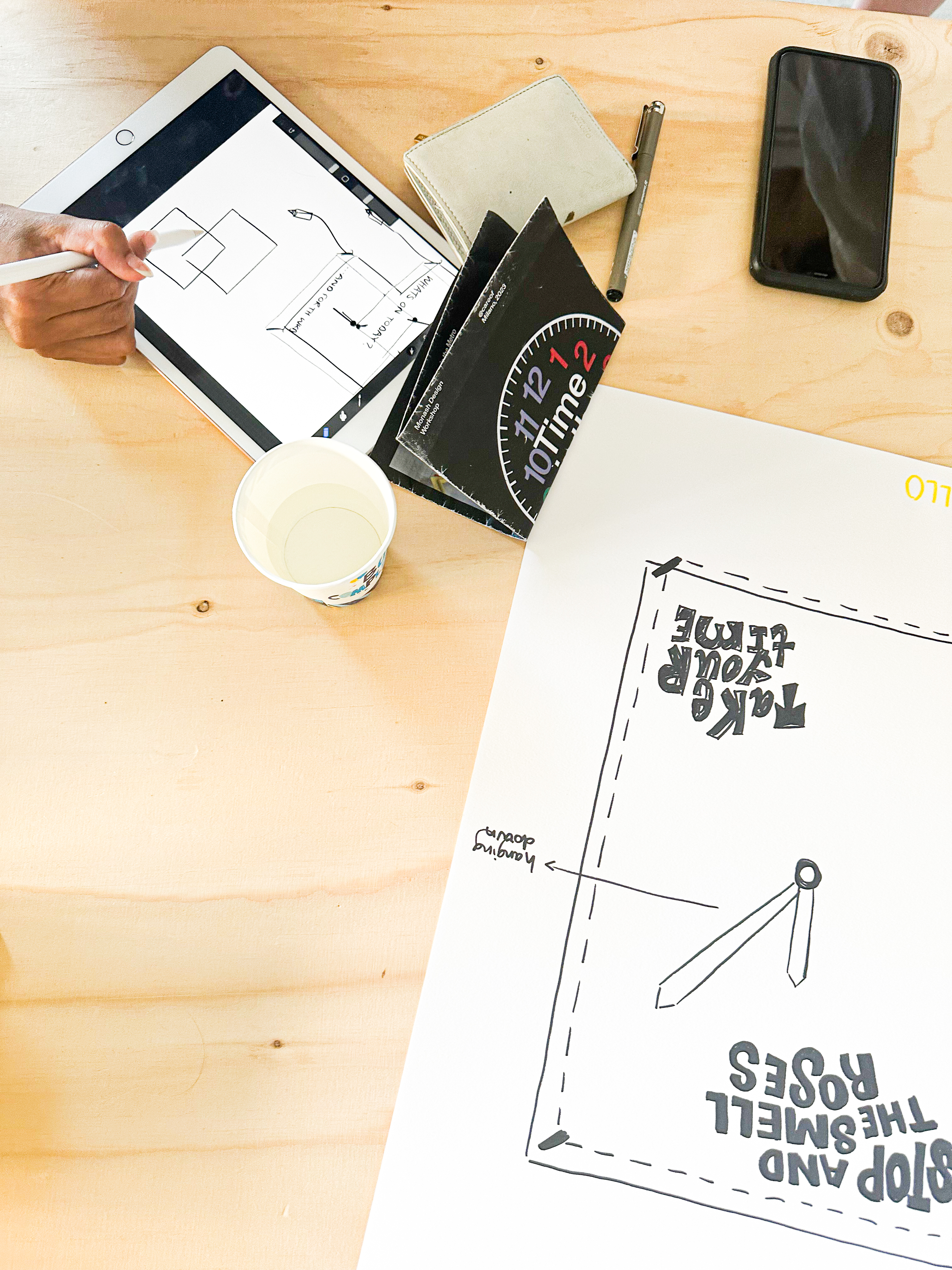
This contrast inspired the idea to explore a clock that is for passengers transporting on holidays in contrast with a clock that is designed to inform work commuters of the time. Overall, we added an interactive element to the ‘weekend clock’ by allowing people to doodle over the disfuctioning clock to convey the fun and carefree elements that the weekend brings. Whereas the ‘weekday clock’ provides nothing but the work start time and knock off time.
My team (Alessangiallo) were tasked to explore the yellow line in the Milan underground metro. We then constructed a clock based on our impressions of this intricate underground landscape. Our final clock reflects the contrast between the activity on the yellow line during the weekends in comparison to the activity during the work week.
The main aspects of the yellow line that the yellow team and I ventured to was the Duomo station, Milano Centrale station and lastly past near the country side. I was impressed by the consistency in colour theme across the visual design of the station. Every bin, roof, train seat and more was a shade of yellow to clearly communicate to travellers that they were on the yellow line. Additionally, the symbols of squares and circles seemed to extend past the yellow line to the other colours as a reccuring geometric pattern. This conveyed a sense of unity throughout the lines regardless of the colour.
As a group, we took these expreriences back to the studio where we mapped out a concept and direction of the clock. We were all on the same page with the idea to include the colour yellow and at least a square or circle as the geometric shape resembling those found in the station. We felt as if the station was fairly quiet due to the number of the Milanese away for the holidays whereas we were rushing around trying to get to each station as part of our uni assignment.
This contrast inspired the idea to explore a clock that is for passengers transporting on holidays in contrast with a clock that is designed to inform work commuters of the time. Overall, we added an interactive element to the ‘weekend clock’ by allowing people to doodle over the disfuctioning clock to convey the fun and carefree elements that the weekend brings. Whereas the ‘weekday clock’ provides nothing but the work start time and knock off time.